If you didn’t know by now 2011 is coming to a close, you better get with it as times are a changing. This is a comprehensive look at what 2012 will bring in web design. Good or bad, it’s coming to a website near you.
1. Fixed Backgrounds With Text Boxes
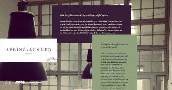
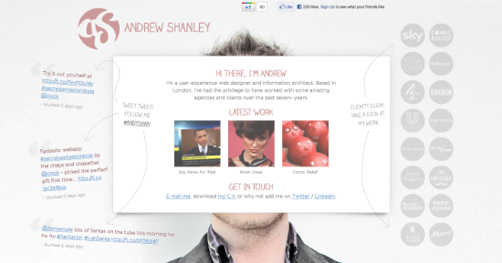
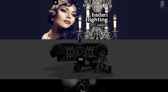
We have seen the fixed photo backgrounds with scrollable text boxes before, but they are popping up more regularly now with a slight variation. Normally, when text boxes are shown, it’s in an organized format (3 to 4 in a row) accompanied with an image or an icon on the home page. With this variation, it takes it to another level by having the layout be continuous throughout the design. Chaos in a minimalistic uniform.
2. Bright Florescent Colors
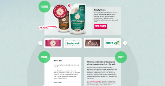
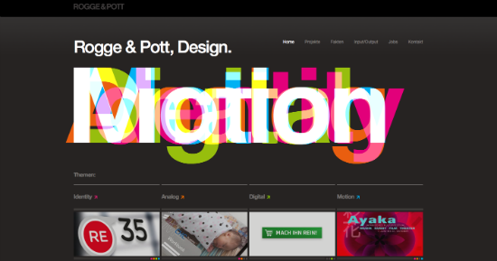
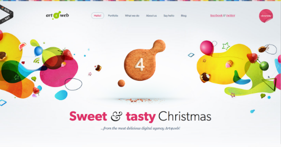
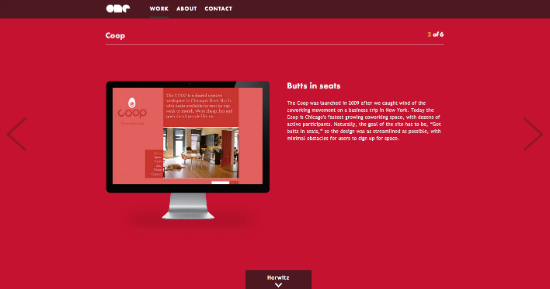
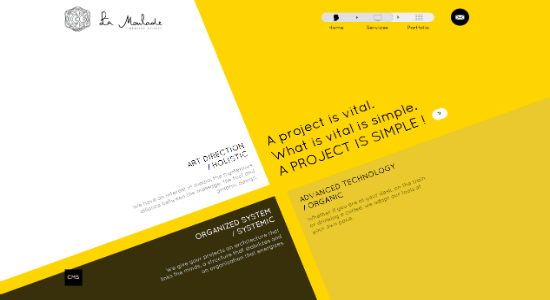
Get out your highlighters my dear designers for this one: neon colors from yesteryear are back with a vengeance! Hot pink, electric blue, bright yellow, and florescent orange are being mixed in with more subdued colors to give websites an edge. Whether it’s in the menu, background, or logo, it’s putting an exclamation point on the overall design.
3. Illustrations (Cartoon Caricatures)
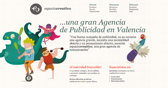
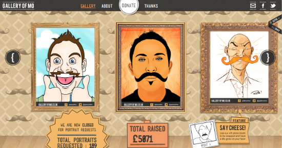
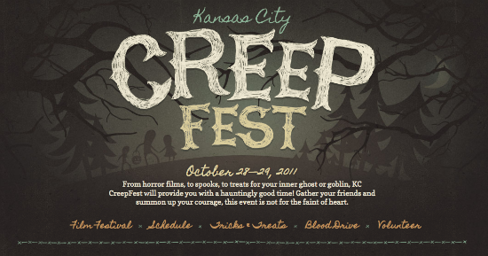
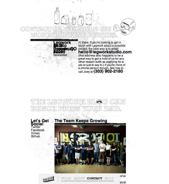
It seems lots of designers, recently, are getting their inspiration from children’s bedtime storybooks. It’s not just used in a header or a footer, it’s being used for showcasing a specific item (i.e., news, product, and/or image) or throughout the design layout.
4. Shapes
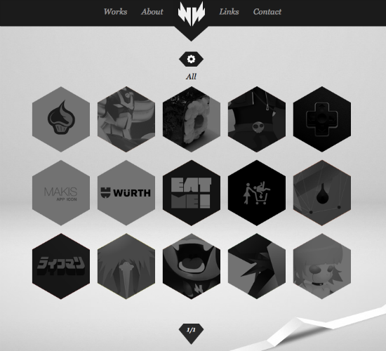
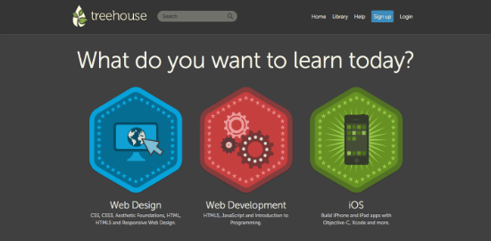
Geometric shapes have been a staple in webdesign. Rounded rectangles, squares, and circles have always been around from the beginning. So shapes are nothing new, right? Wrong. The redheaded step-child of shapes like triangles, polygons, hexagons, and trapezoids are being utilized in design. Not only just one at a time, but several of the usually ignored shapes are being put in the same area. We normally see this in graphic design, but it’s making it’s way into web design.
5. Keyboard Controlling Navigation
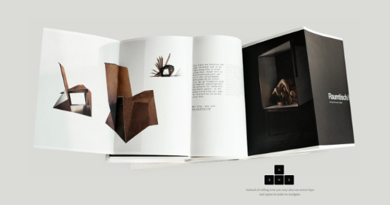
Your mouse is going to get some much needed rest. A new option for navigating through a website can be found on your keyboard not your mouse. Arrow key navigation is gaining popularity with many websites, and it’s mostly being implemented in horizontal websites.
6. Tilted Typography
Looking through websites for inspiration not too long ago, noticed something unique: the text was at an angle. Interesting. A couple of websites later, more angled text. Don’t know about you, but love to see more of it. It’s definitely a trend to look out for in 2012.
7. Large Typography
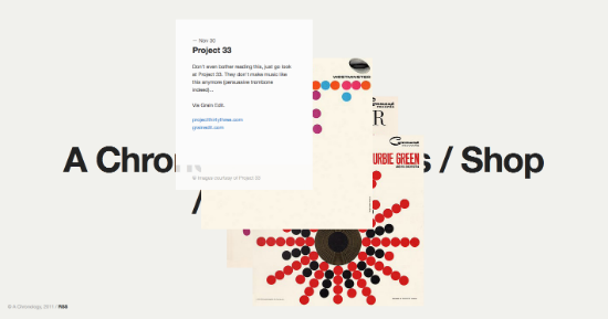
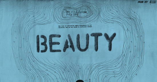
Guilty as charged. Call us biased if you want, but we love oversized typography. Something tells us that we are not the only ones either, as so many designers are also pushing the normal boundaries of font sizes.
8. Single Page Websites
Everyone has been to a website where there is no menu or links to be found on the site, just countless scrolling. It’s a trend not innovation. Surely, there is going to be an infographic in 2012 measuring this sudden spike in popularity.

